Have you ever wanted to be able to import information from an image file but didn’t have the original data? Well we’ve got you covered. Join Alignex engineer Eric Weber as he walks you through the process of creating X/Y plots on any picture you can find.
Video Transcription
In this short tutorial I’m going to tell you about a free tool I use to create X/Y plots in a picture file. The software is called Engauge Digitizer and can be downloaded for free from the this website:
https://github.com/markummitchell/engauge-digitizer/releases
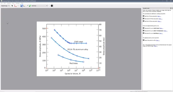
Often times when using SOLIDWORKS Simulation I need to look up material property curves such as a stress strain curve or a non-linear study or an SN curve which is used for a fatigue study. I’m going to show you how to use Engauge Digitizer to extract the raw data for an SN curve for three different materials from a picture I have downloaded from the internet.
Once inside of Engauge Digitizer, all I need to do is import my downloaded picture file.
Choose File > Import > Select file > Click Open
Once this is open we are shown a Wizard that will help guide us through the process.
Once we click Next, we are able to name our different curves. So in this case I’m going to name one curve 1045 Steel, the next will be 2014-T6 Aluminum and then the last one is Red Brass.
We are then presented with some options for how our curves will be drawn. In this case I’m going to choose With Lines. I can finish out the Wizard and then on the right side we are going to see the different steps we need to go through in order to digitize these curves. So to set up our axis we are going to use the Axis Point Tool.
You’ll notice that our X-axis runs from 1,000 to 10,000,000,000 and is in a logarithmic scale. Our Y-axis goes from 0 to 500. I’m going to zoom in on the lower left corner of our axis and select a point where the two axis cross. I’ll enter 1,000 for the x and 0 for the y coordinate.
Over on the right side, I’m going to do the same thing. I’m going to select my point and this time I’ll type in 10,000,000,000 because that is what is represented on the X-axis) and then 0 for the Y-axis.
Now pulling my window over to the Y-axis and bringing it up, you’ll see our 1,000 and 500 point. So again I select that point and type in 1,000 for X and 500 for Y.
Once that is done we will get a quick preview of the boundaries of our plot and again I just want to point out our X-axis is on a logarithmic scale. So we do need to change a setting to put that on a logarithmic scale. Just go into Settings > Coordinates > Log > OK.

So now the next thing we are going to do is set up the points on our curves. I’m going to use the Curve Point Tool. I’ll zoom in on my steel curve and then just start selecting my points. I’m going to make sure I grab my end point and then I’ll just start making selections along the curve. The more points you select the higher the resolution, so as we get down to this tight corner I’m going to start selecting a lot closer together. As we go straight again I’m going to get a little more spacing. So the more points you select, the more information you are going to get at the end.
Next I will select Aluminum from my curve list. I’ll scroll down a bit to find my aluminum curve, and then again I will just start selecting points along this curve. This time I am going from right to left and it doesn’t really matter which way you go as long as you are still picking in order. So I’ll make the last few selections from my Aluminum curve and then we will move onto the Red Brass curve. Again making sure we pick that end point, and then a few points along the curve.
Once all of our points are selected, we can now export our curve. To do this:
Choose File > Export > Save*
* Notice it is going to save this as a CSV file that can be imported into software such as Excel.
Jump over to Excel. Once there I can go ahead and import my CSV file:
Open > All Files > Select CSV File > Open
Once that is imported you’ll notice we get all of the raw data from all of those points we have selected, and you’ll see that it’s separated by material. Now we can very quickly throw together a quick scatter plot.
Choose Scatter > Scatter with Smooth Lines
You’ll see it brings in those curves. Our X-axis isn’t shown on a logarithmic scale I can adjust that.
Right Click Image > Choose Format Axis > Adjust Minimum & Maximum Point > Choose Logarithmic Scale > Close
Now we are left with an Excel chart that shows us that information that we saw in our picture.
Thanks for reading! Don’t forget to subscribe to the Alignex Blog to always stay up-to-date on the world of SOLIDWORKS.